Seamless reporting for e-conomic
Design customizable P&L, balance sheets, and cash flow statements with real-time data from e-conomic. No more spreadsheets—just seamless insights tailored to your business in one intuitive platform.


Reporting
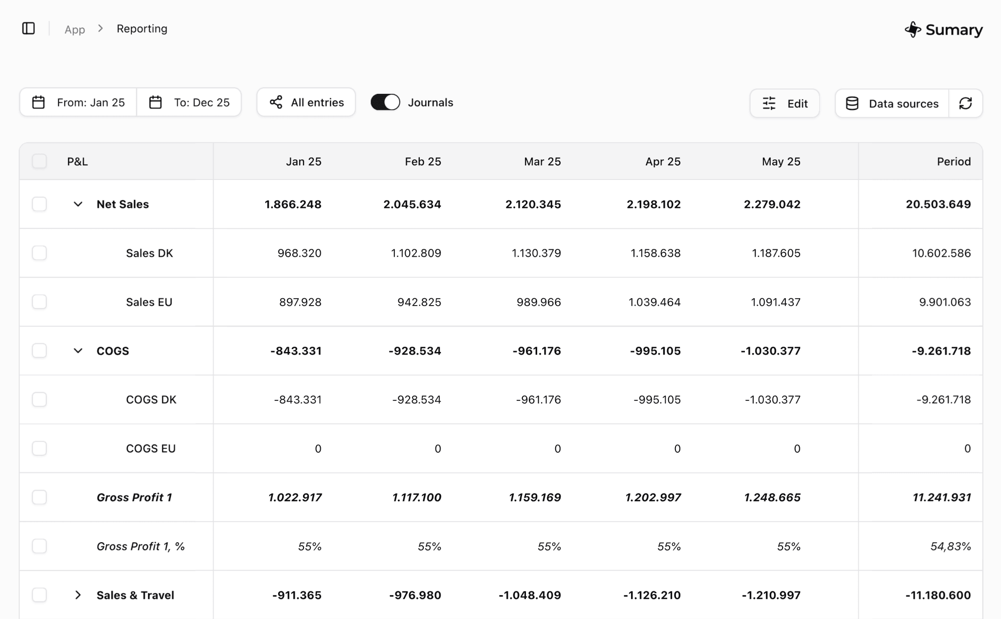
Fully customizable financial grids
Create P&L, balance sheets, and cash flow statements tailored to your business. Group, calculate, and format rows with ease, while enjoying seamless integration with e-conomic for real-time accuracy.
Goodbye Excel
Leave behind manual imports and Excel headaches. Sumary offers effortless reporting.
Default best-in-class
Start with expertly crafted financial grids tailored to your business type and needs.


Row grouping
Group multiple accounts into one row for a clear, concise view of your finances. Create categories that simplify complex data, tailored to your business needs.


Calculated rows
Add calculated rows to create metrics like gross margin or sales percentages. Build custom formulas between rows without the complexity of spreadsheets.


Row formatting
Customize your rows with bold text, italic, or percentages. Highlight key metrics and keep your financial reports clear, structured, and presentation-ready.
Experience seamless integration with e-conomic. No more manual data exports to Excel. Automatically sync accounts, journal entries, and transactions, keeping your reports accurate and always up-to-date.
Journal entry support
View and edit journal entries directly in Sumary, simplifying corrections and insights.
Map once then forget
Map your e-conomic accounts in minutes, and let Sumary handle the rest automatically.


Reporting
Inspect, search, and filter transactions
Click a cell for any row and month to see the transactions behind the number. Quickly resolve questions like 'Why are marketing costs so high this month?' Simply press, inspect, and find out with powerful search and filter tools.
Simply press a cell
Drill down transaction details by clicking any cell to see what’s behind the numbers.
Edit journal entries
Make quick corrections to journal entries directly in Sumary for better accuracy.
Reporting
Beautiful charts


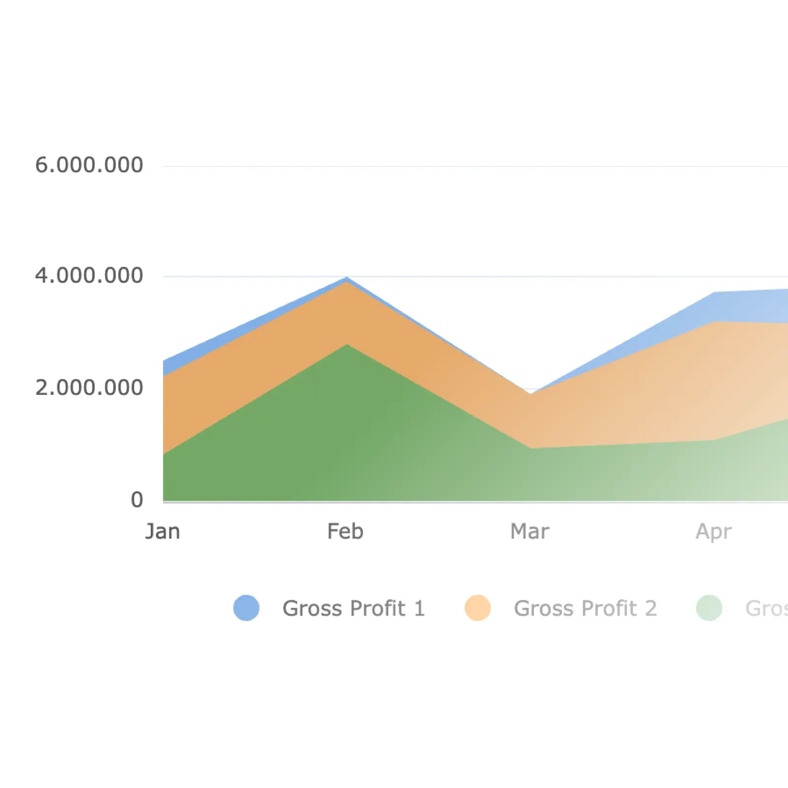
Create stunning charts effortlessly with real-time financial data from e-conomic. Say goodbye to importing data into third-party tools. Visualize insights instantly, with updates always in sync with your latest numbers.
Select data to include
Choose the rows and periods you want to visualize, and Sumary handles the rest. Easily customize your charts for focused insights on key financial metrics.
Chart types
Pick from various chart types such as bar, line, area, pie, or stacked, tailored to your reporting needs. Create visuals that make your financial story clear and impactful.
Download
Download your charts as images for presentations or reports. Share professional-looking visuals that are always up-to-date with your financial data.
Reporting
PDF report builder
Create polished, professional, and branded PDF reports effortlessly with real-time data from e-conomic. Skip manual imports into third-party tools and refresh monthly reports for investors or stakeholders in minutes.


Headings
Add custom headings and subheadings to structure your report and highlight key sections.
Rows & charts
Include account data or visual charts to your reports to create a clear financial overview.
Comments
Add comments and insights to provide context, explanations, or highlight important financial metrics.
Download
Download your tailored report as a PDF and share it with investors or stakeholders instantly.

